Every year or so, my homebrewer brother asks me to come up with a label for the new beer he’s working on. Two years ago, he emailed me about a 10% ABV behemoth he was calling “Assumption of Risk.”
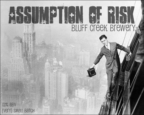
After a bit of back and forth, we came to this design.
I loved the final product but would be lying if I said it was my first choice. There was plenty of back and forth about inspiration, imagery, and (most of all) font choice. Below are the two themes we nixed but wanted to keep filed.
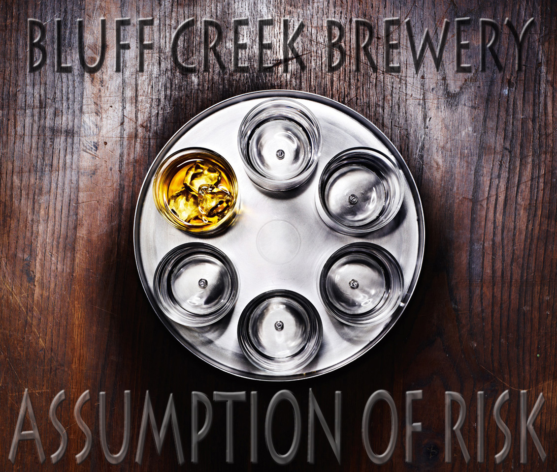 First one I slapped together for this. If we went with the Russian Roulette theme, the whiskey could have been turned into beer fairly quickly.
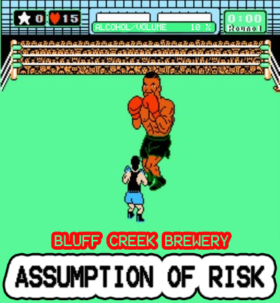 This was my vote all the way. (Note the ABV in the green bar up top)
